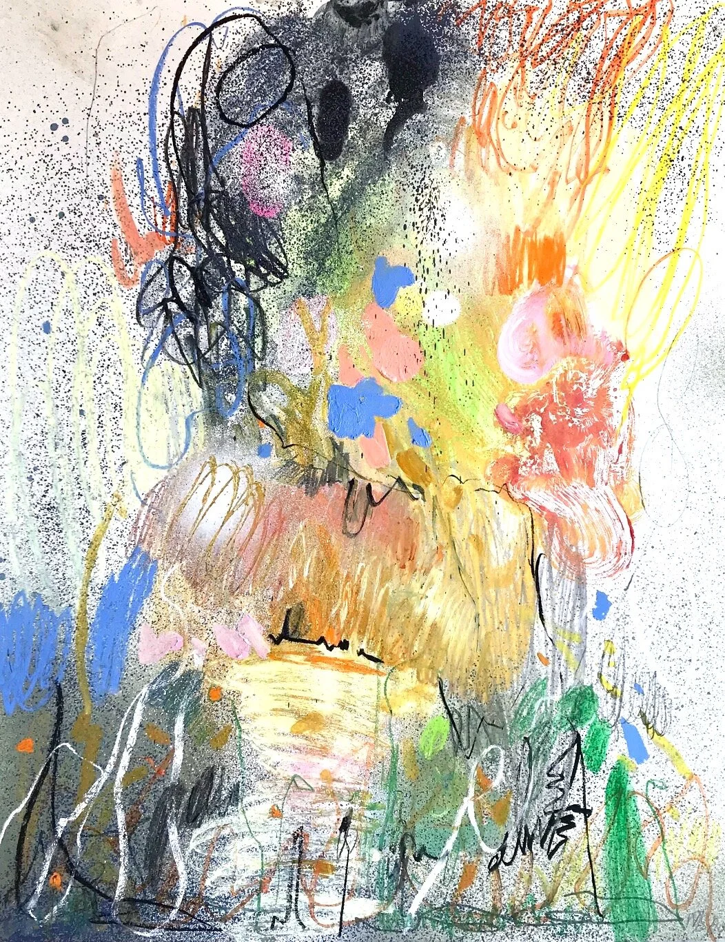
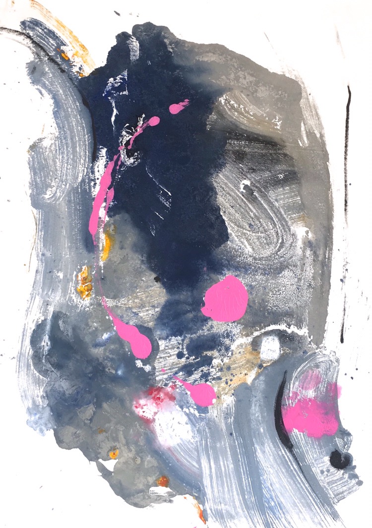
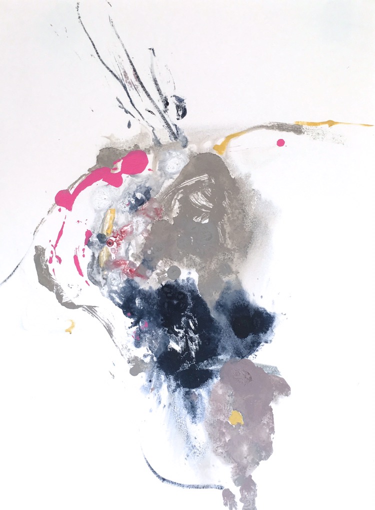
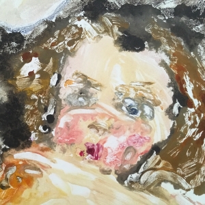
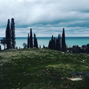
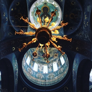
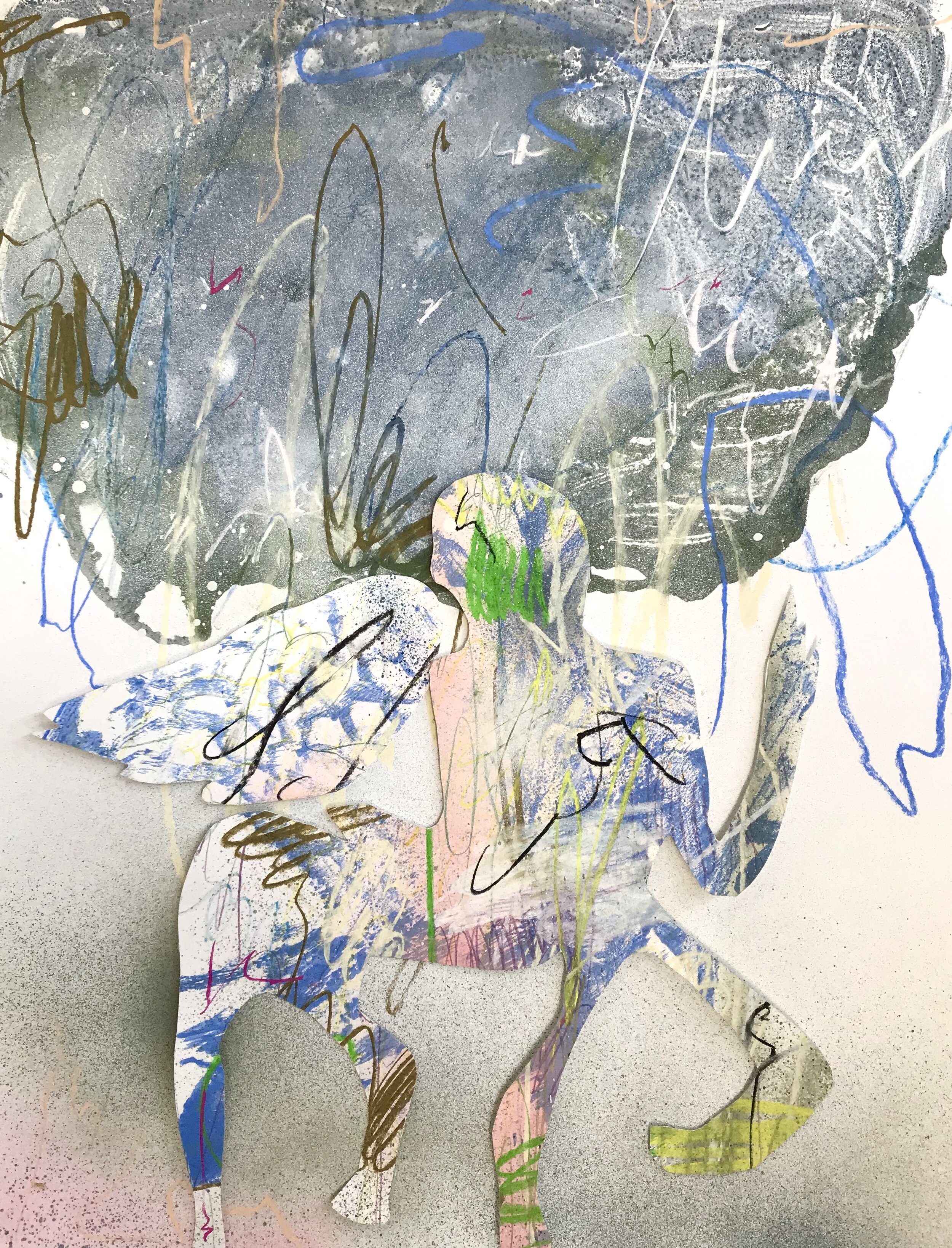
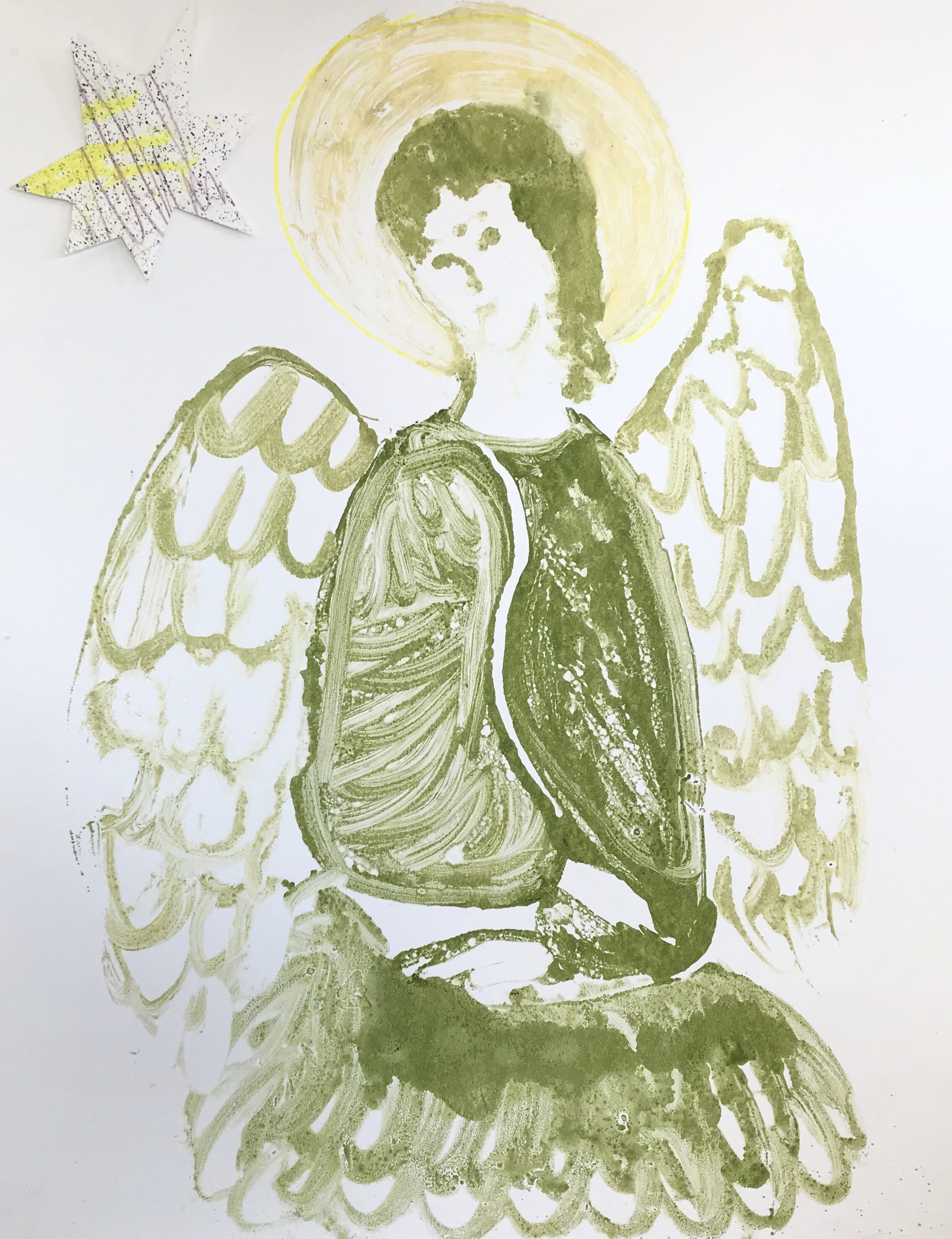
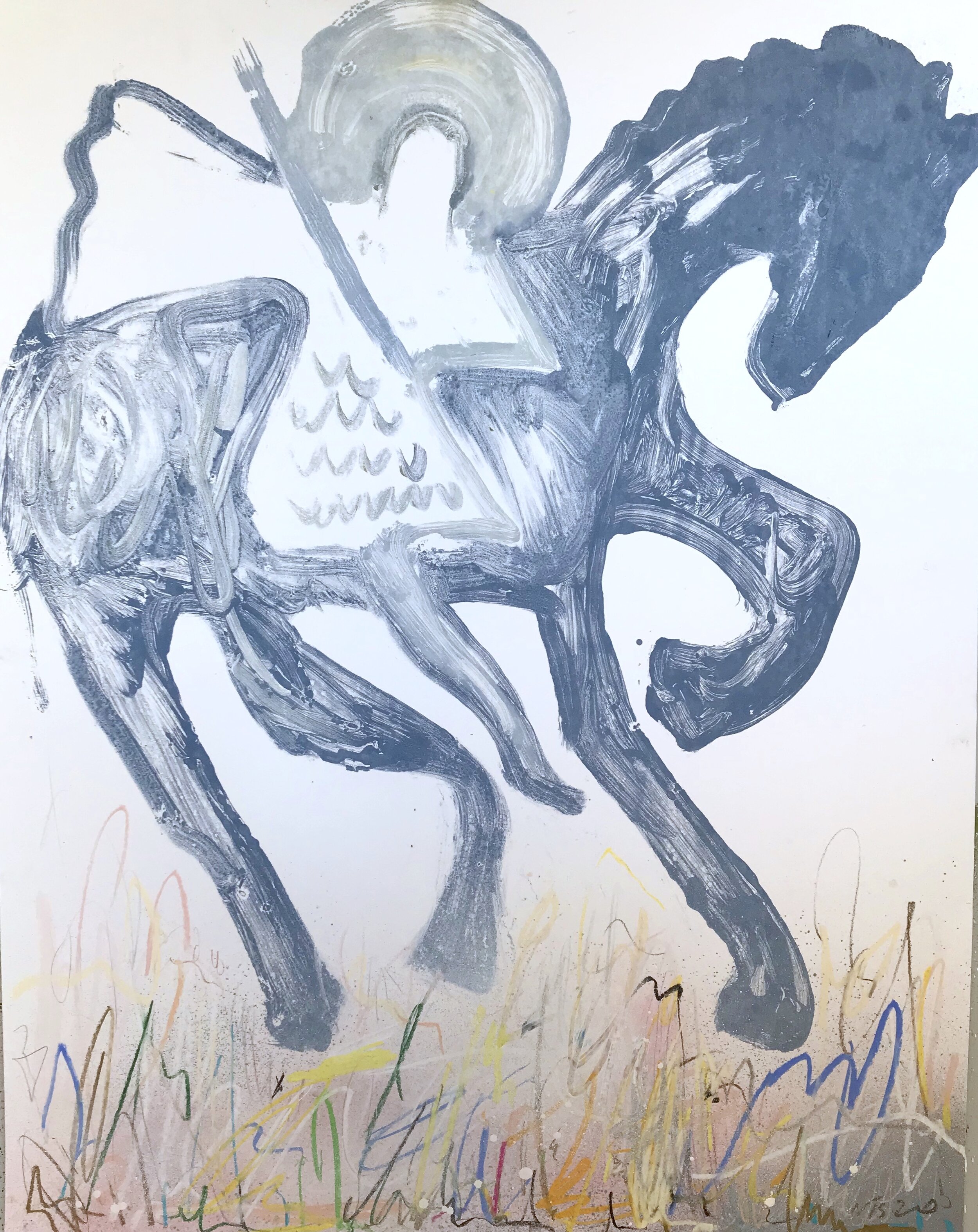
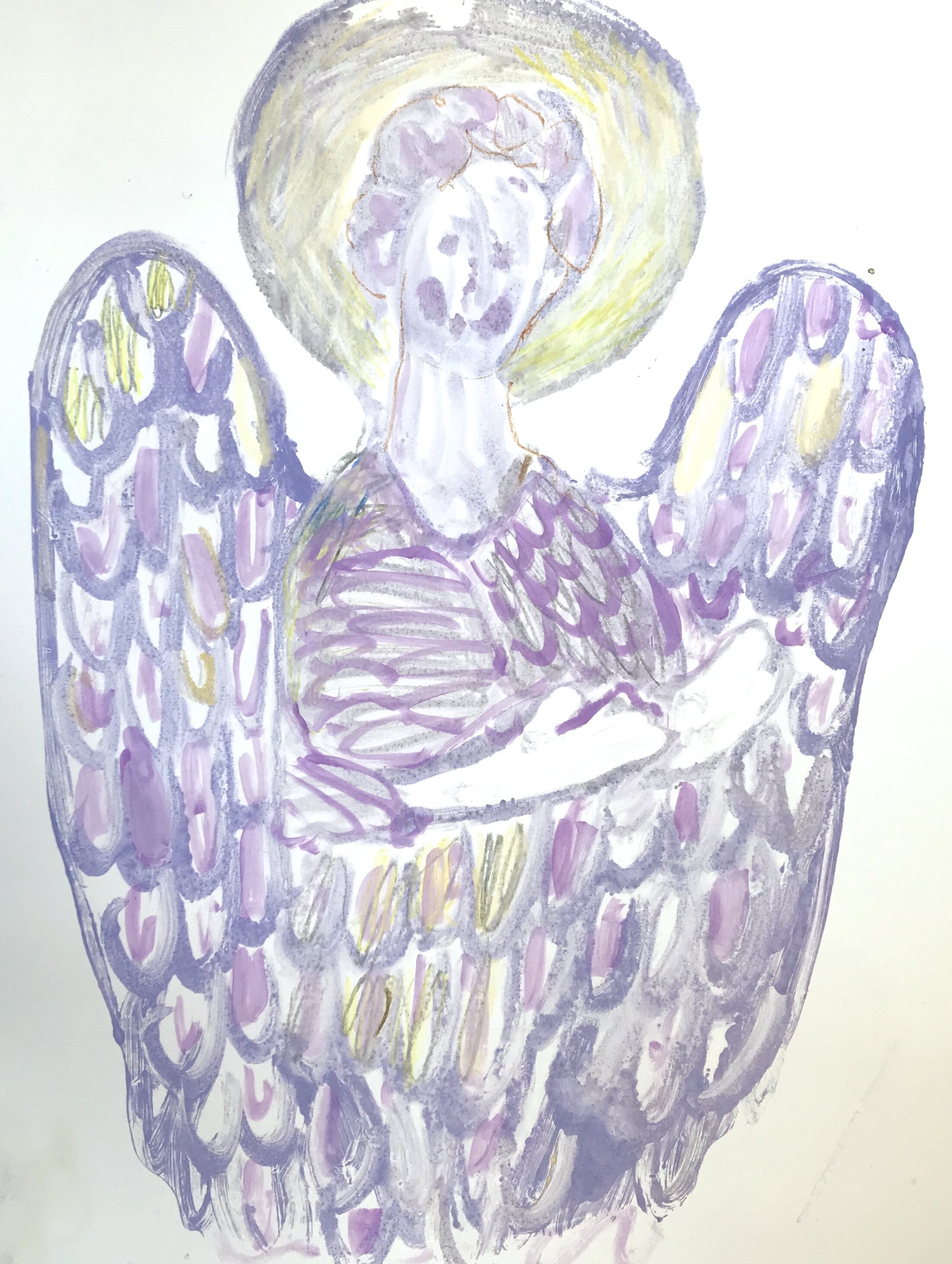
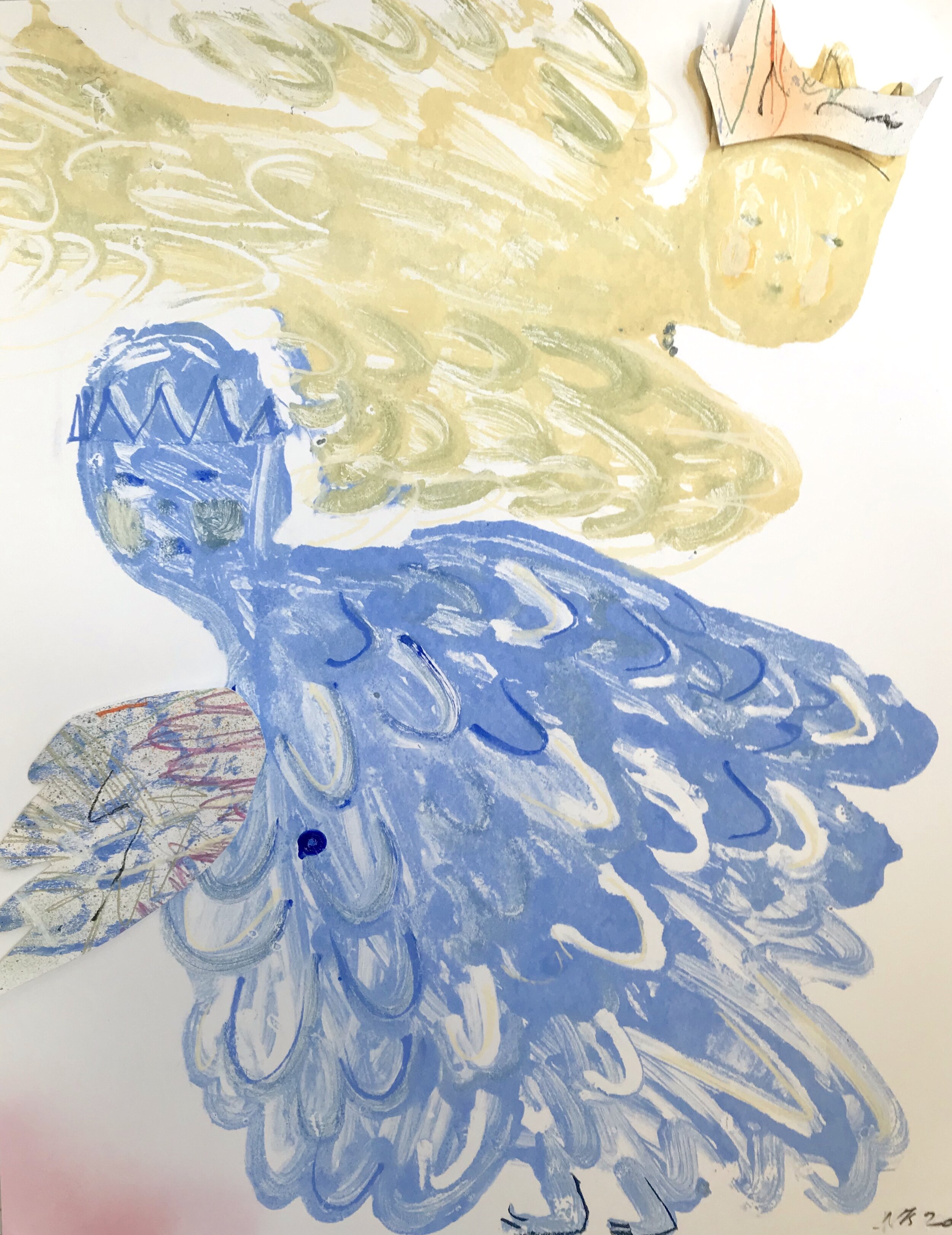
As a child, playing outdoors, running around fields & pretending to be heroes, animals, creatures and other magnificent things, reality and imagination truly intertwined. The pieces below attempt to create an immersive environment, blurring the lines between the majestic, spiritual and natural realities, bringing to light the more pressing realistic issues that address the future of our surroundings and the environment.

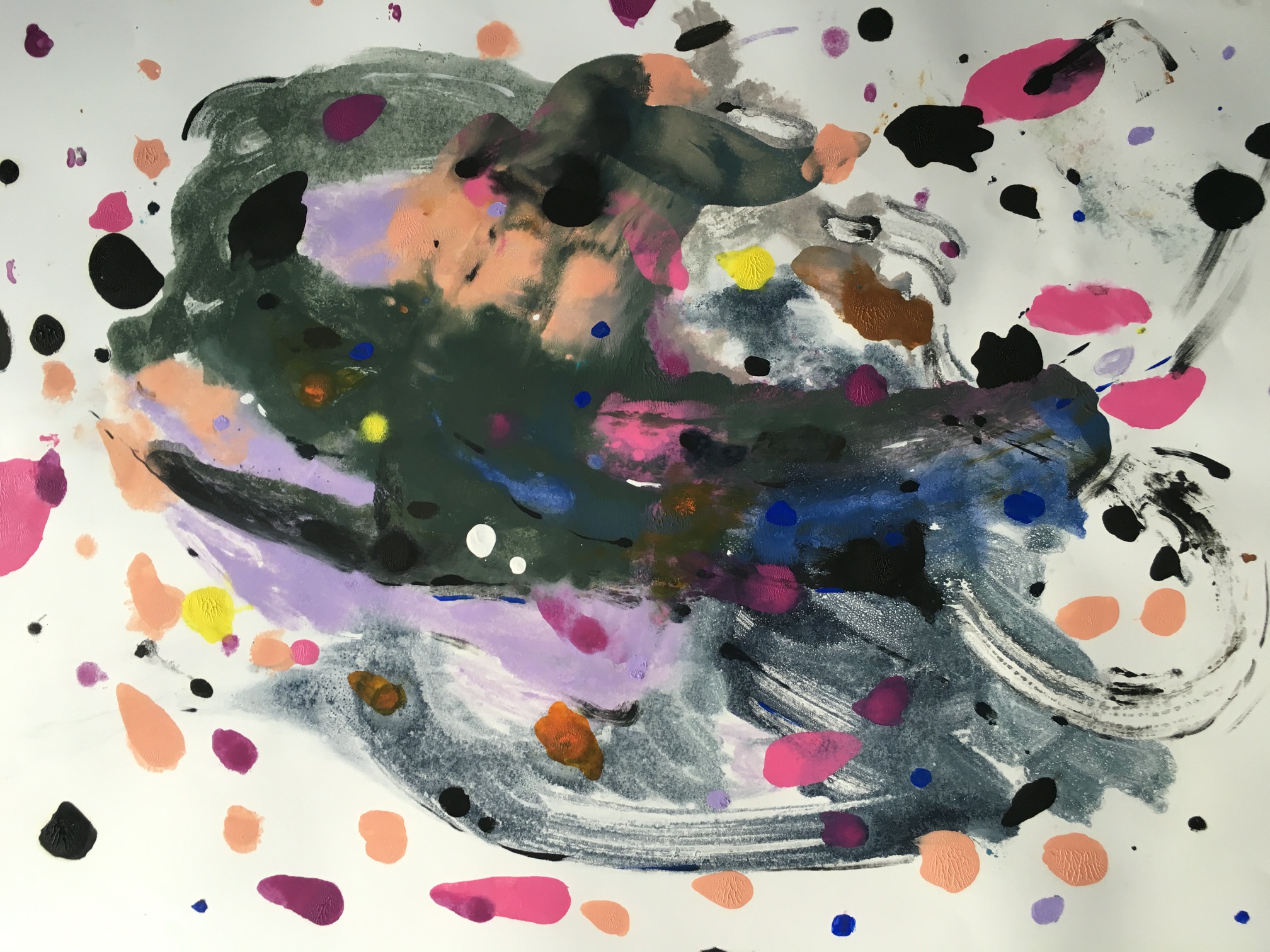
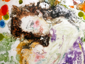
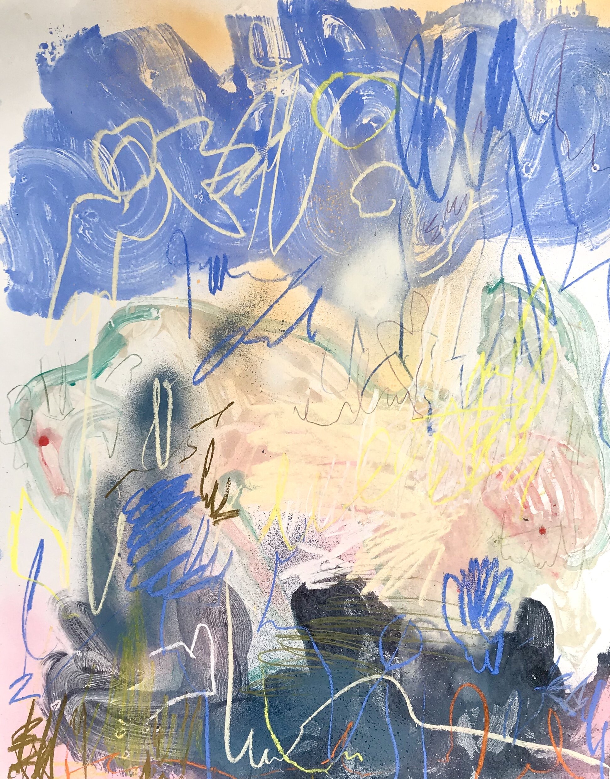
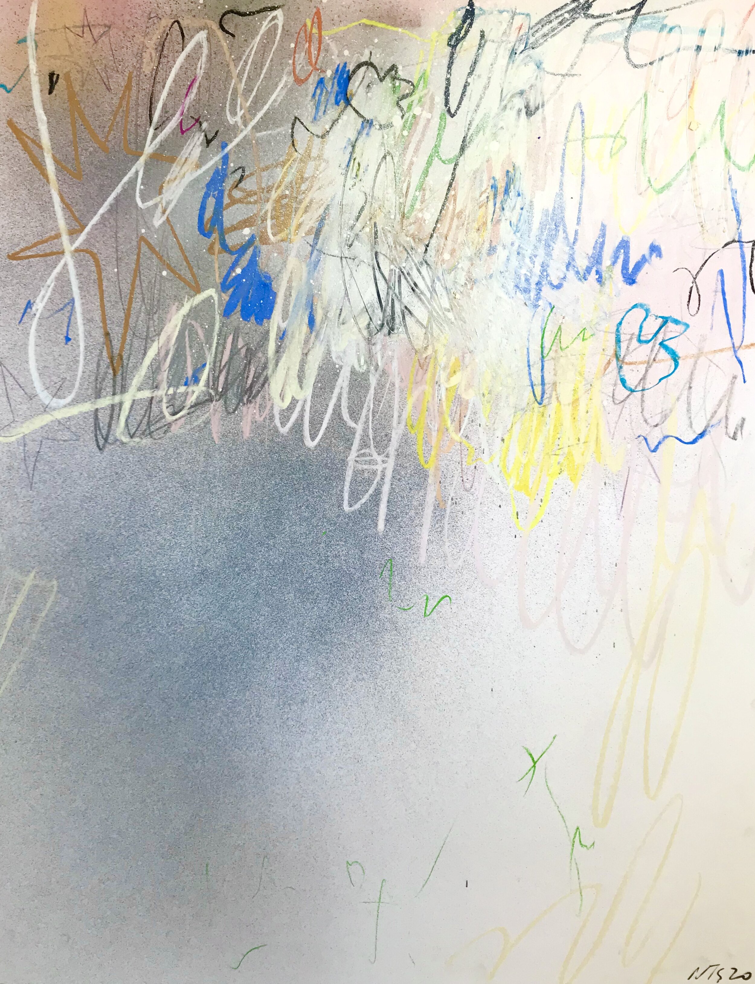
The sky rejoices at the sight of repopulated habitats. Spirits and animals co-exist in chaotic harmony. Hidden behind layers of the engrossed composition, a figure is kneeling to drink from a brook. The ‘Fields, Saints & Magic’ series started after I completed an unusually large composition, this sparked interest in a more figurative or story-telling direction.

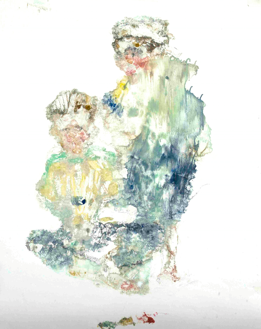
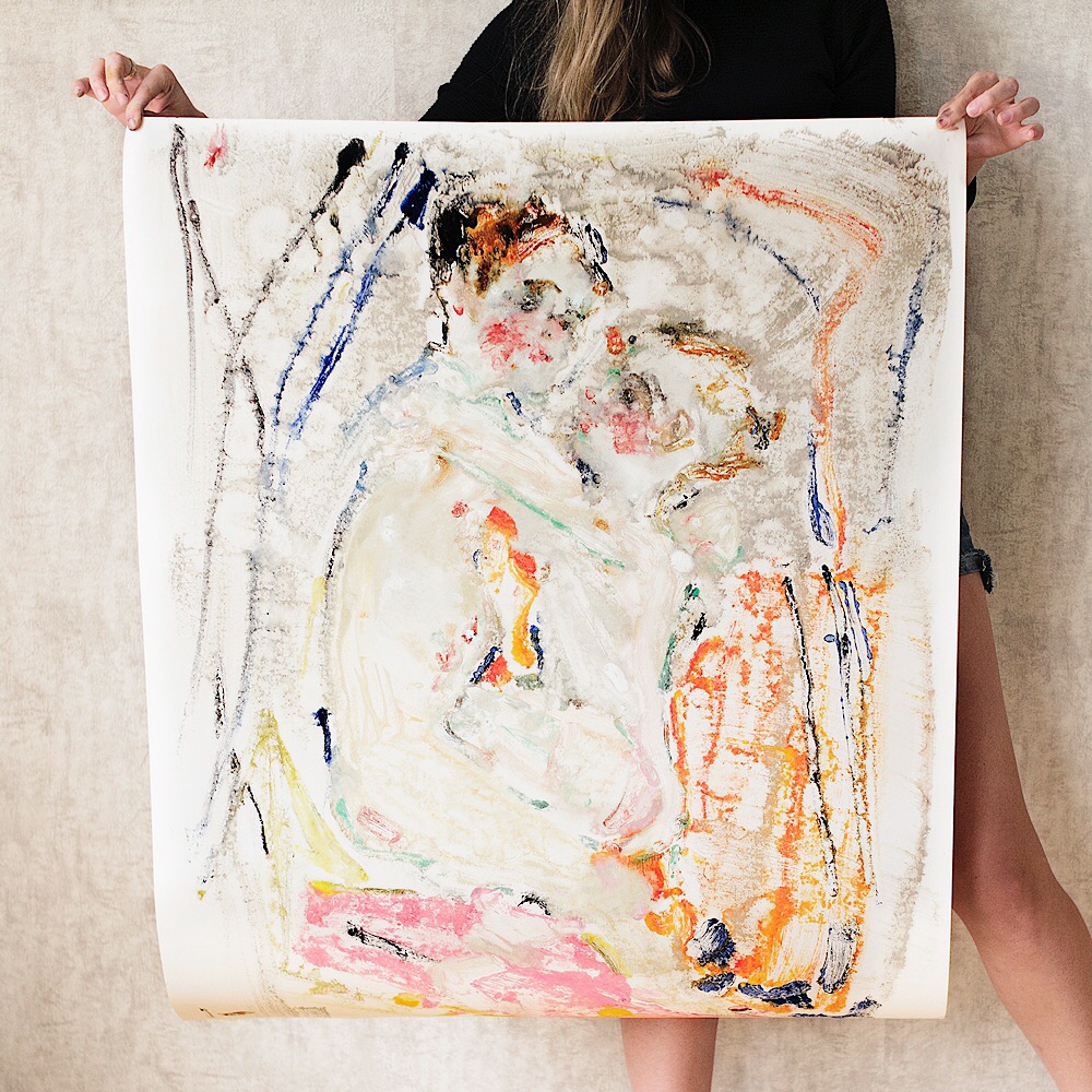
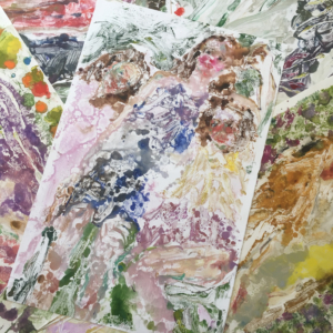
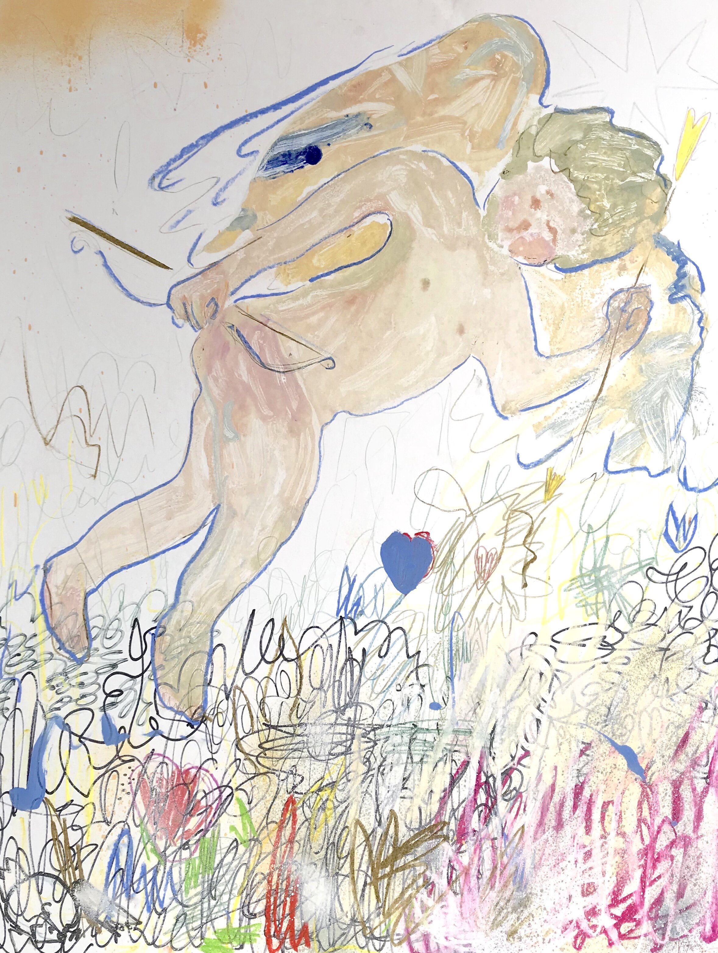
‘Tea For Three or The Picnic’, is a homage to the medieval icon The Trinity. Instead of the traditional sacrificial calf, the angelic trio is having a celebration with cake tea and fruits. I’ve adapted this because, in a way, this is a personal piece. Originally, The Trinity depicts the three angels who visited Abraham at the Oak of Mamre, to deliver the news of Sarah’s miraculous and long awaited pregnancy. I made a personal reference to my own life by changing the centre of the composition to something more festive and joyous, the birth of my son.

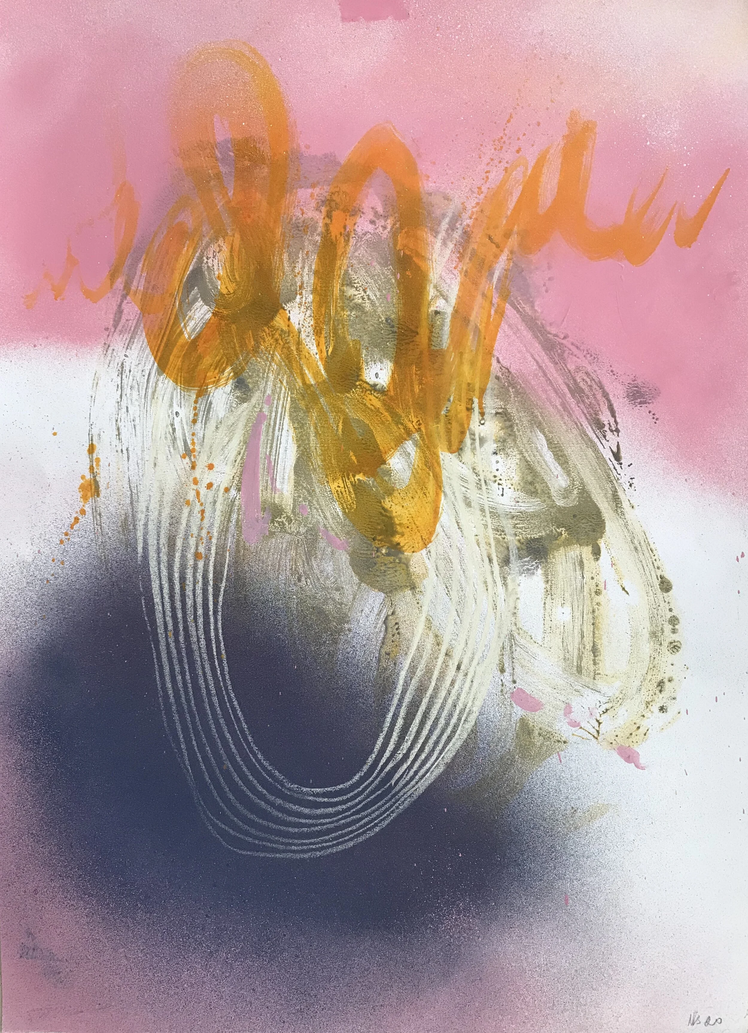
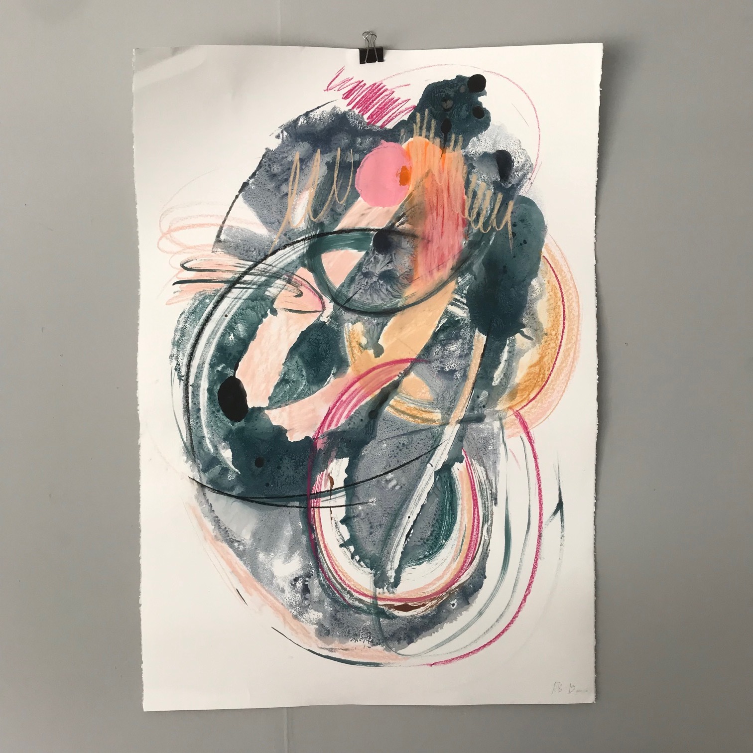
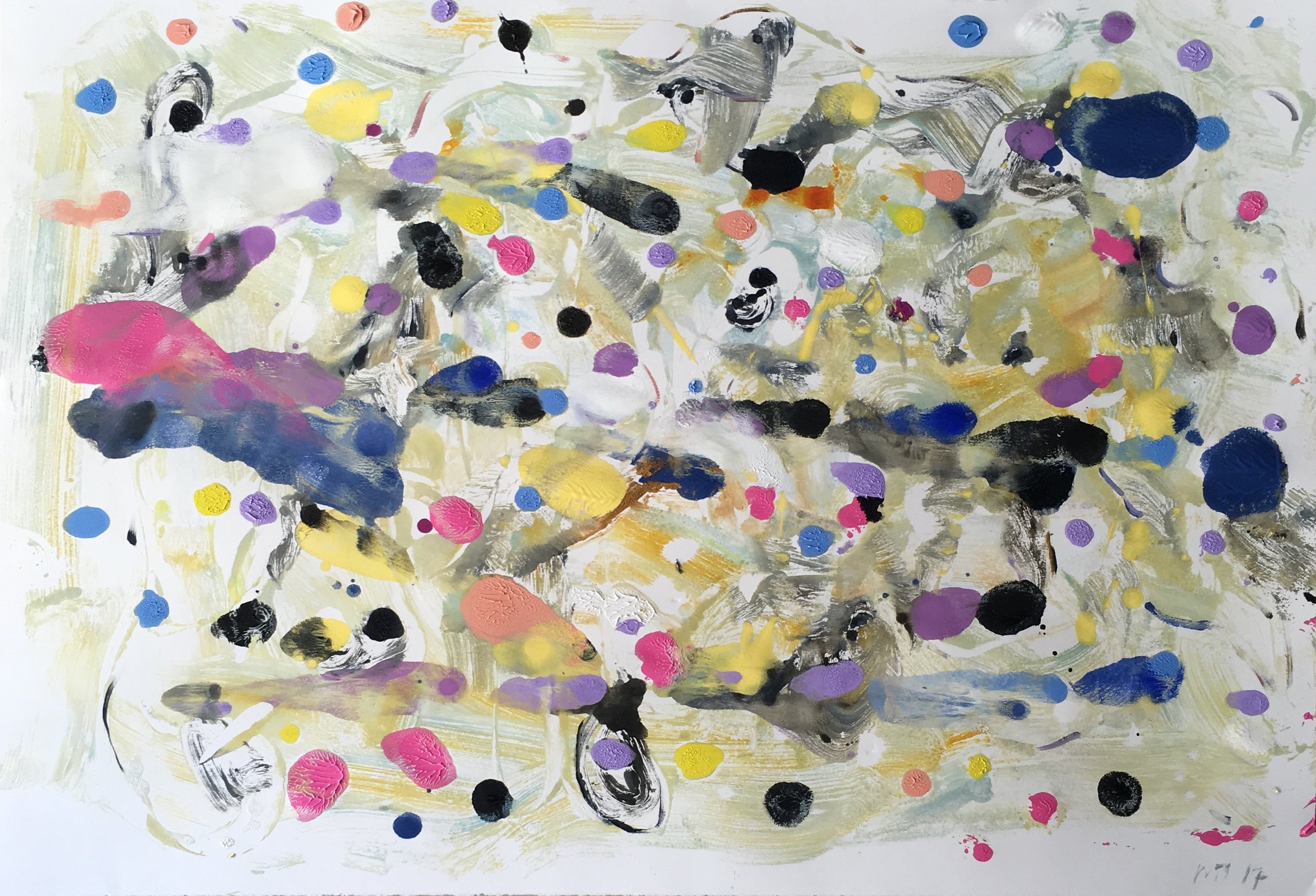
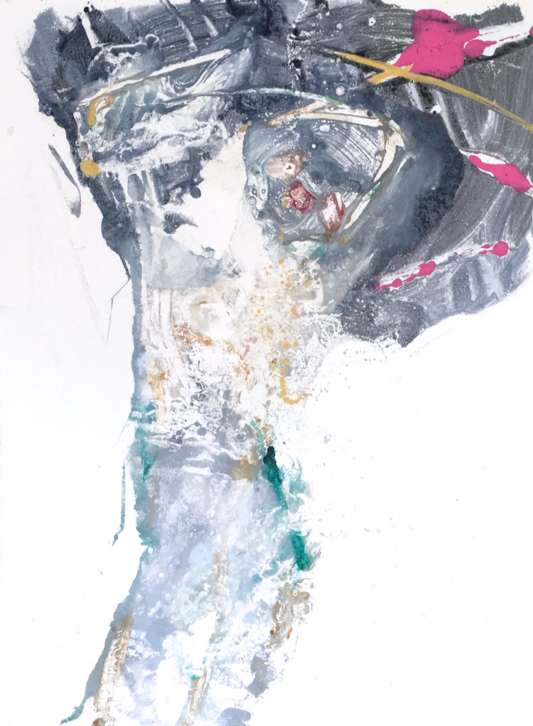
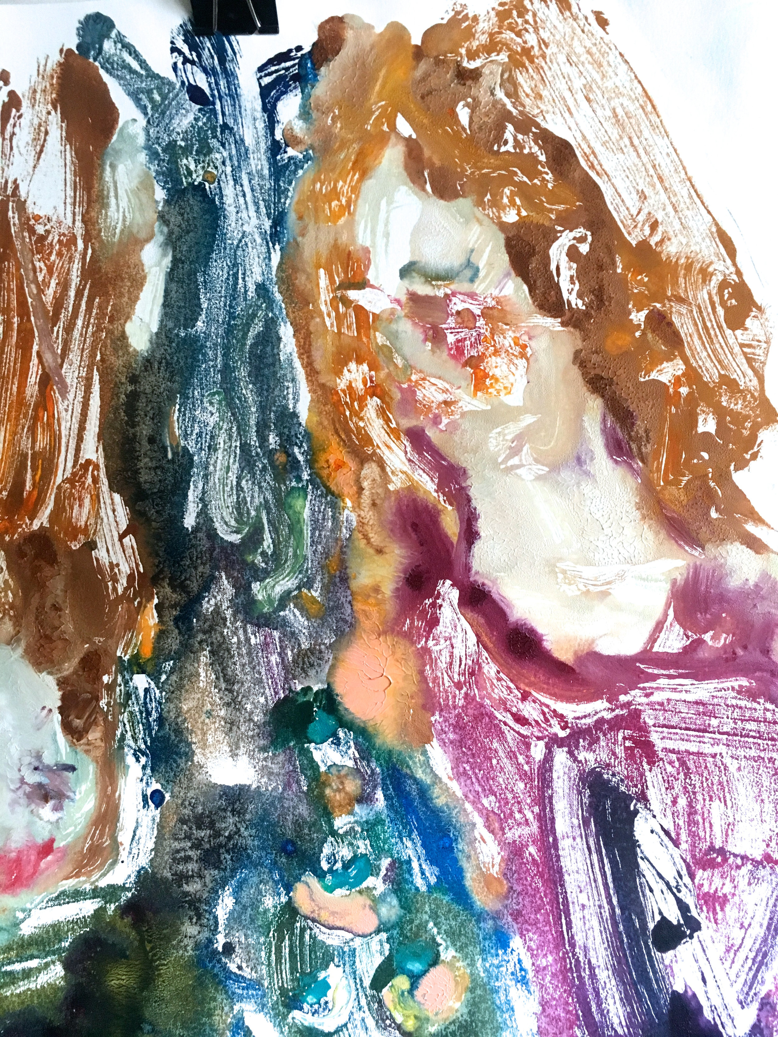
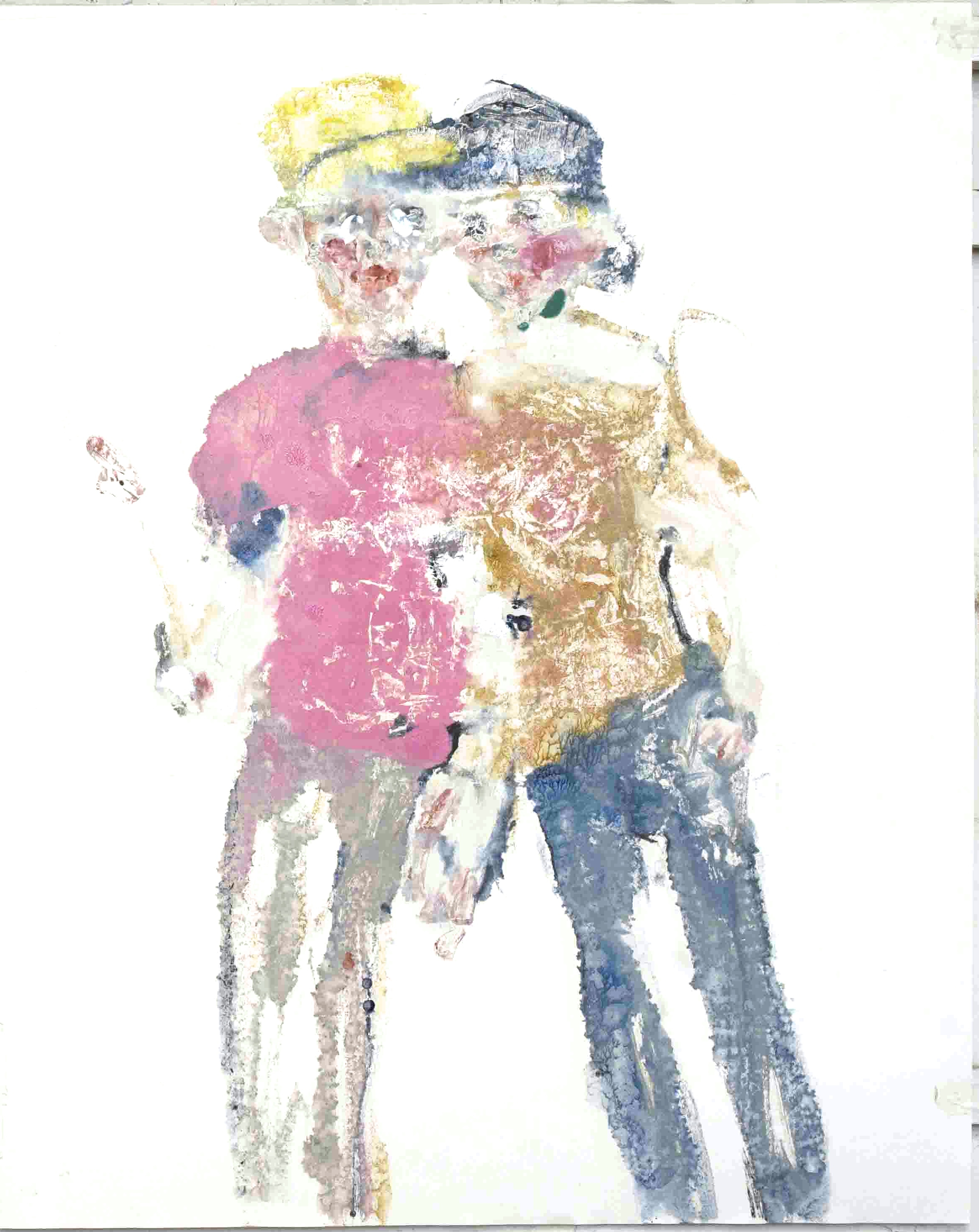
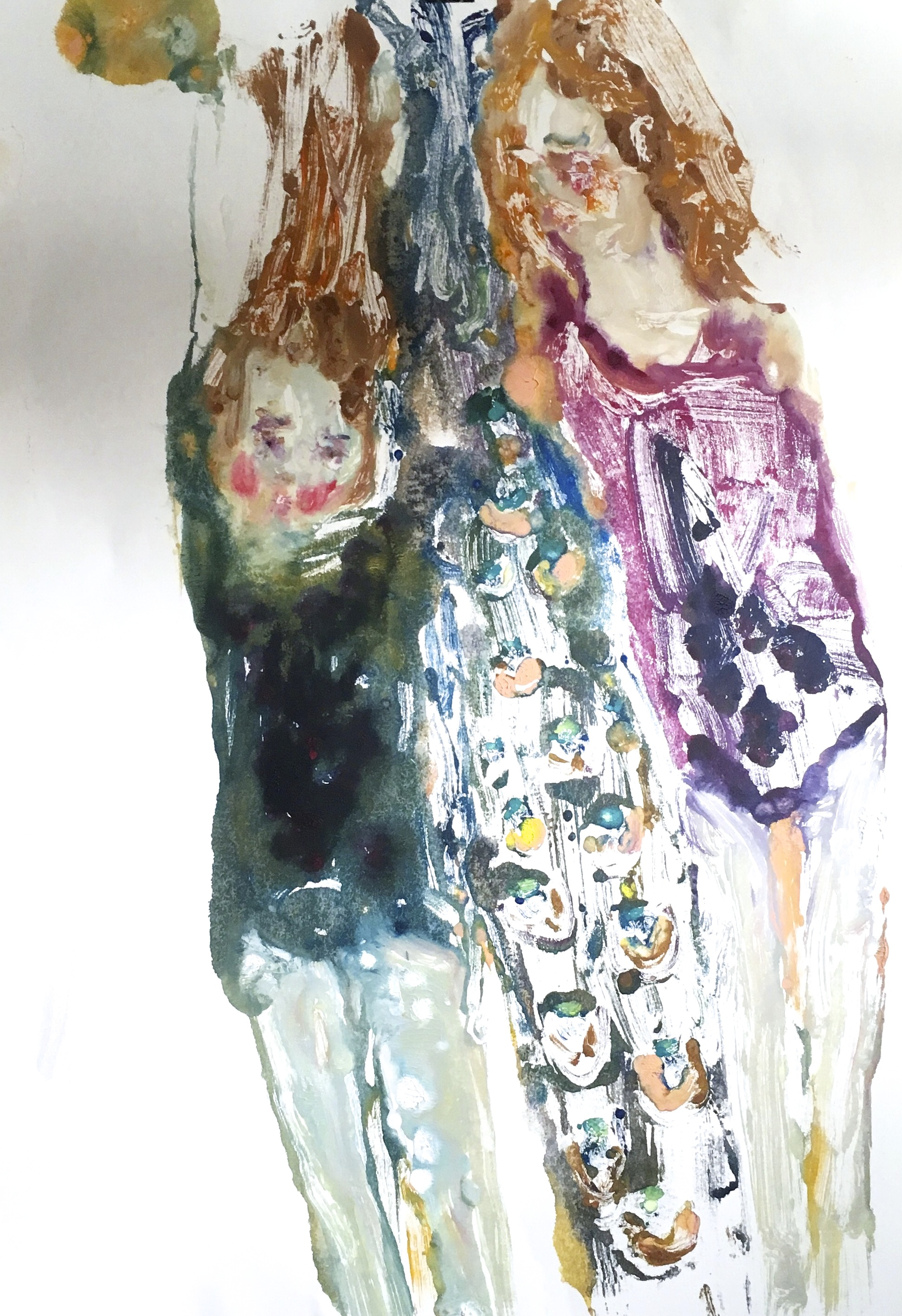
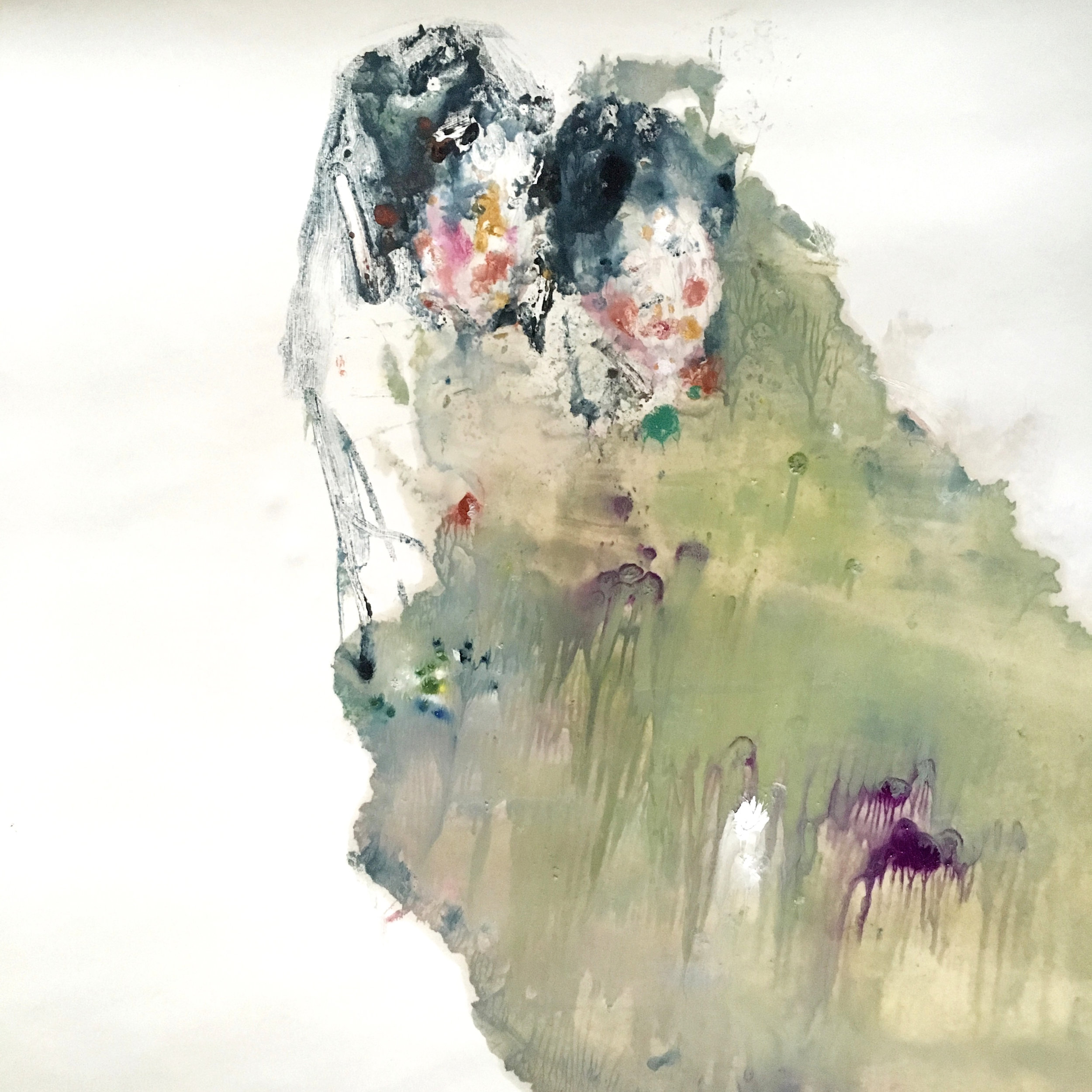
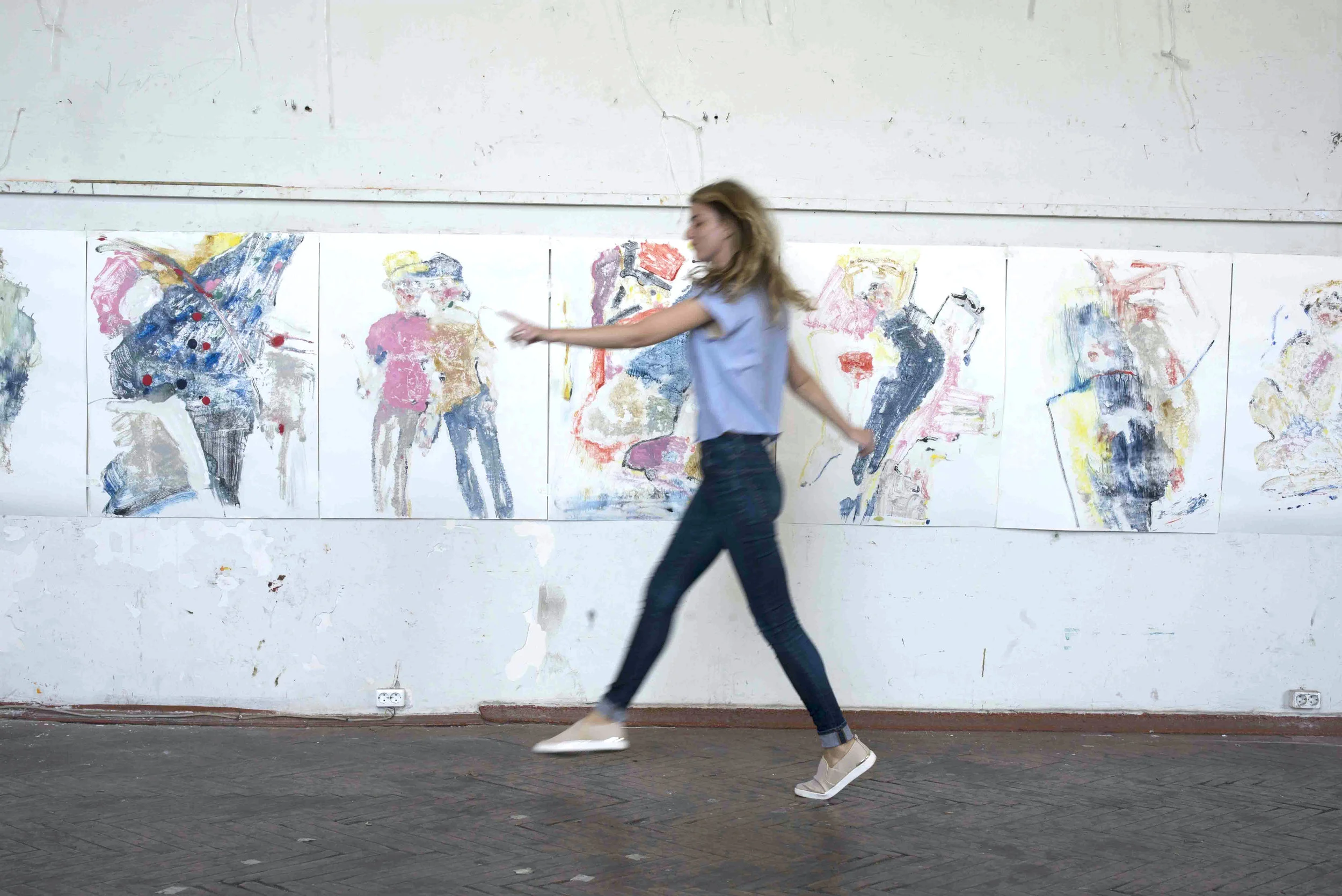
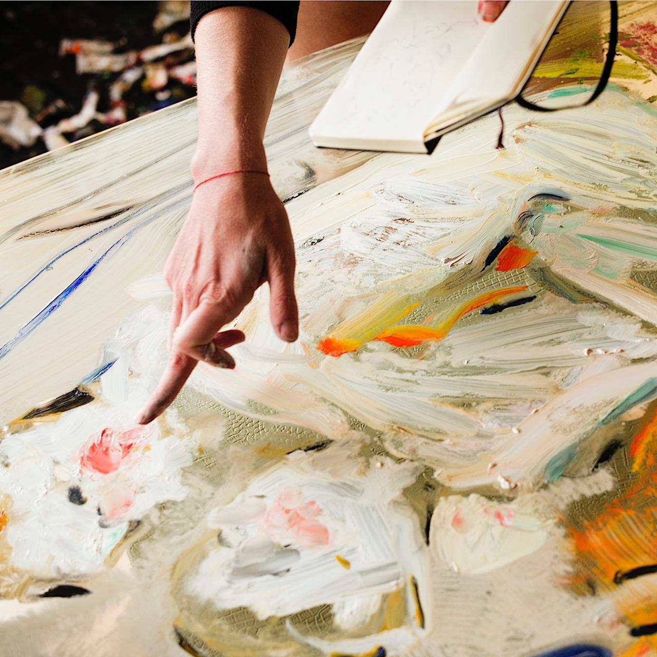
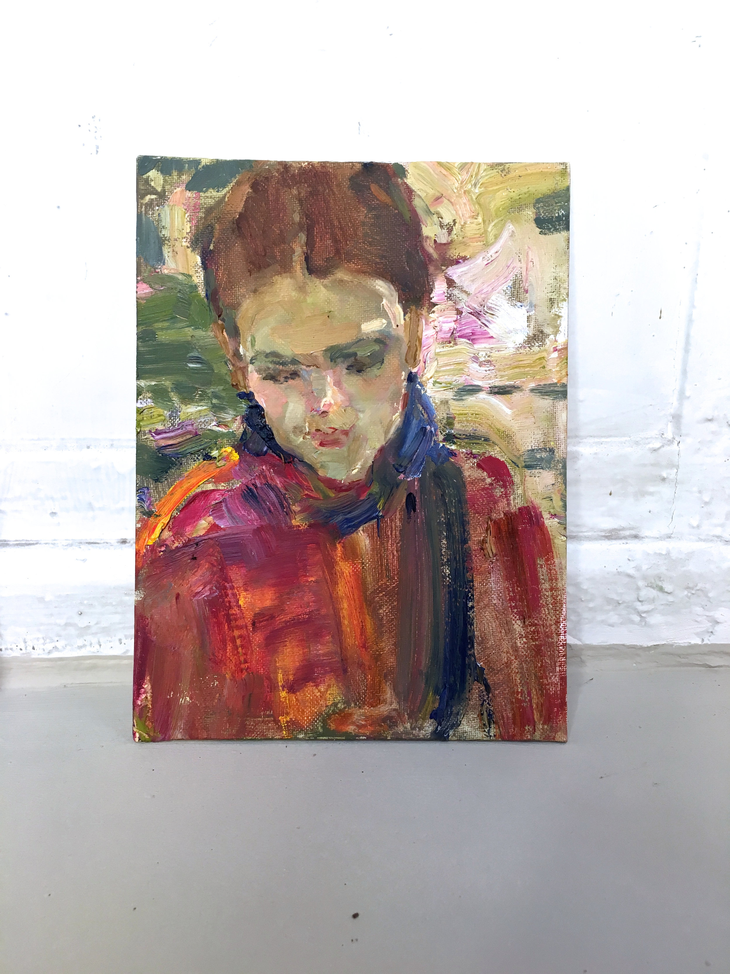
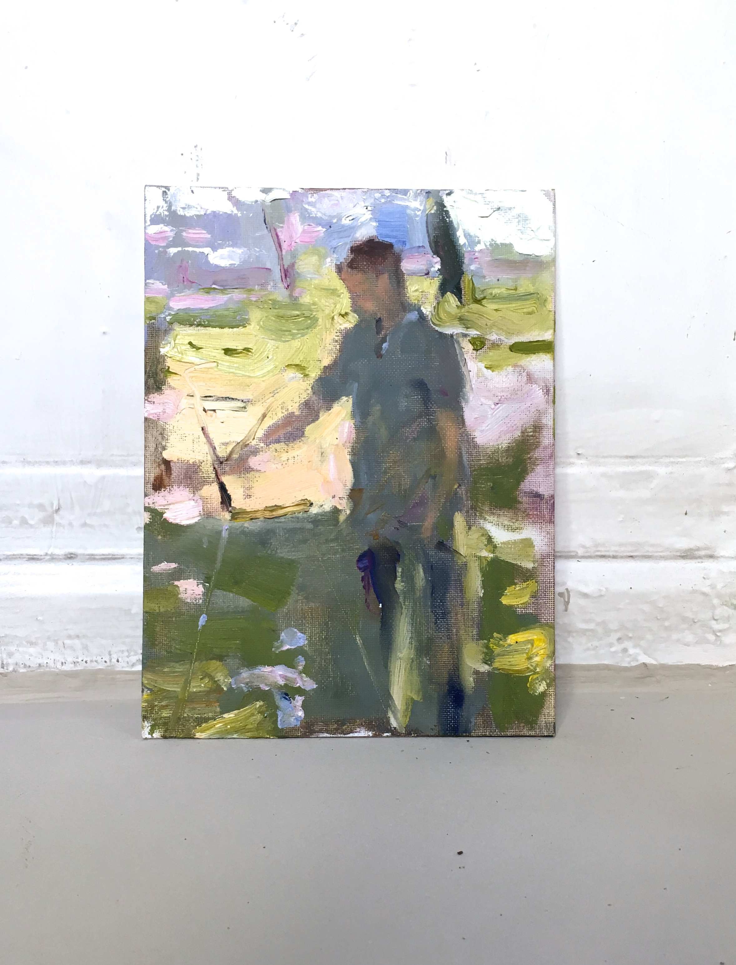
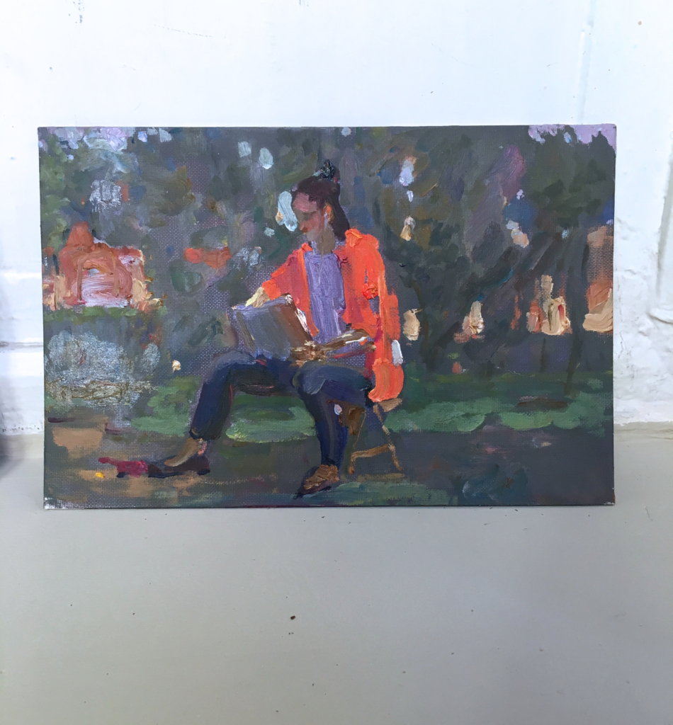
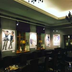
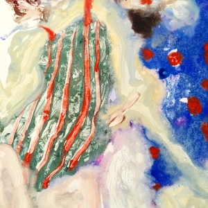
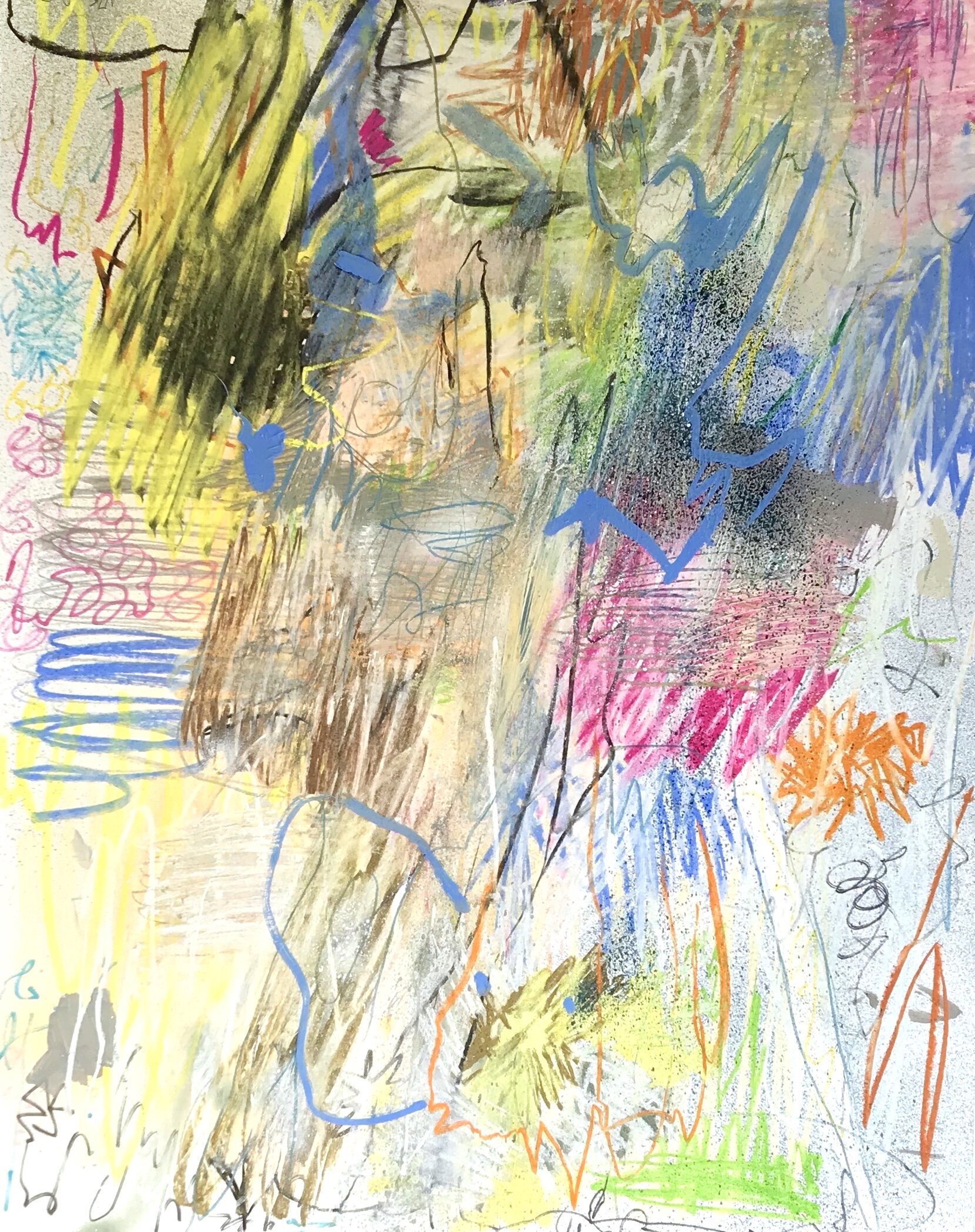
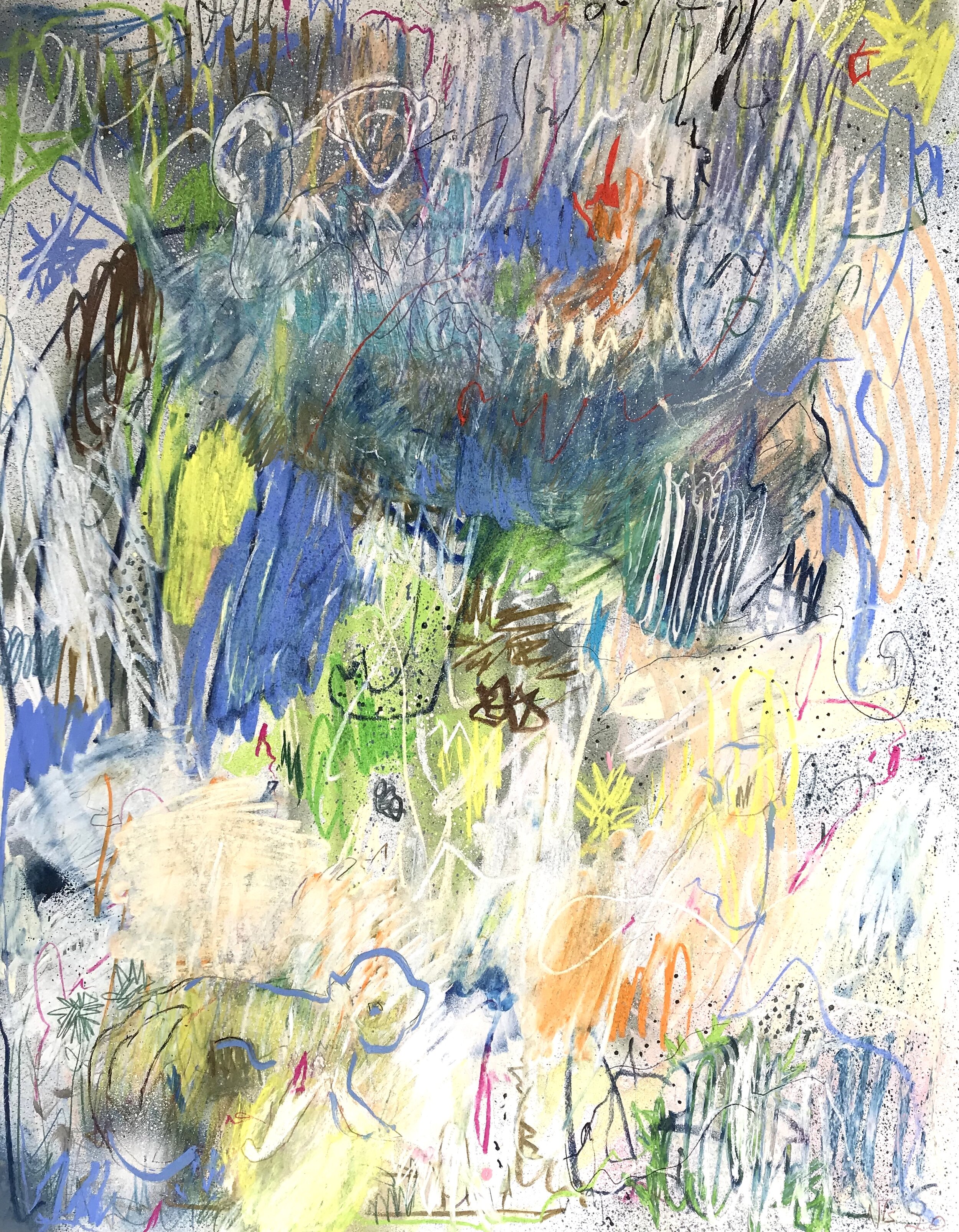
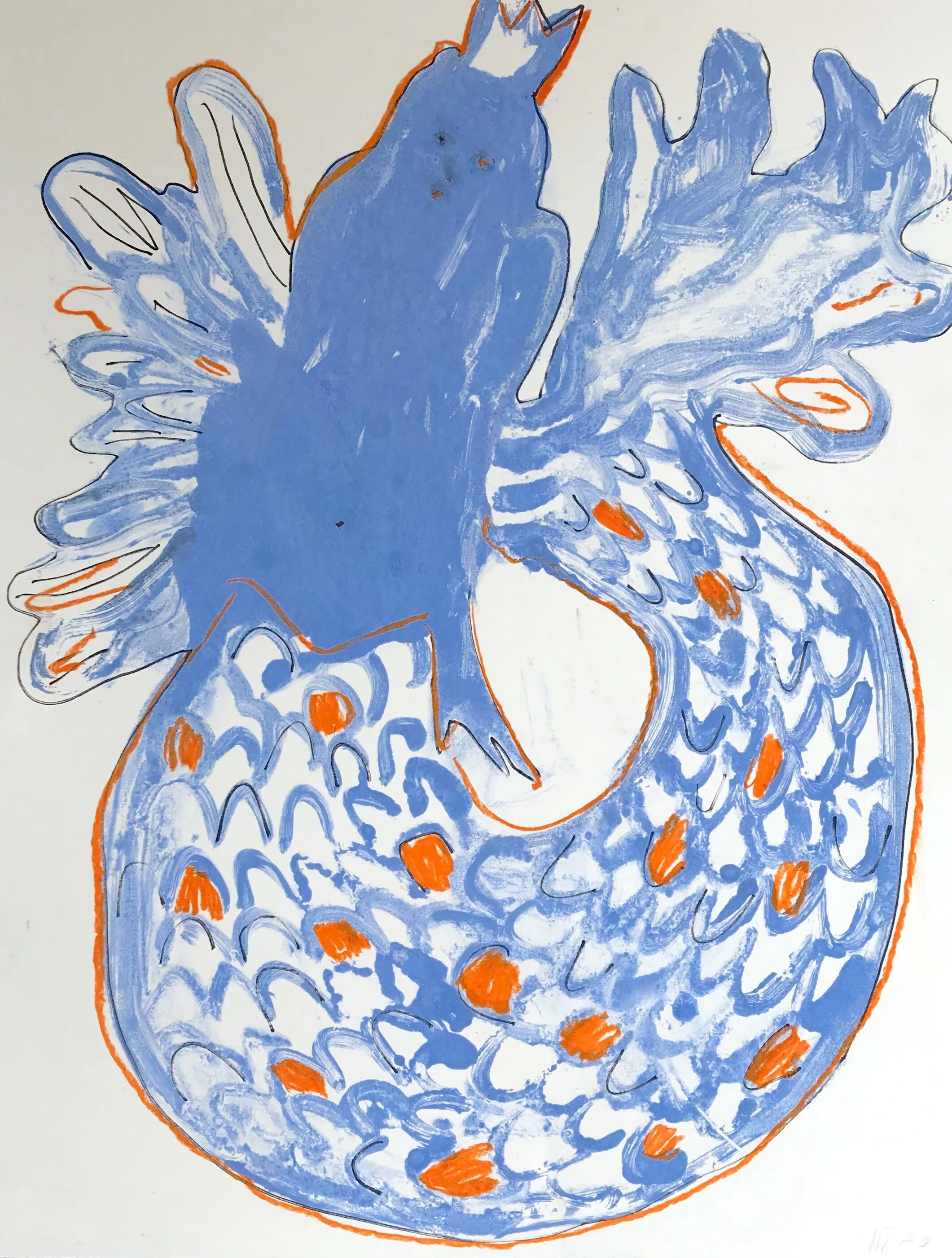
Bellow, pieces serve as a pastiche of the larger works, operating as an extension or individual study of the characters and recurring themes that dominate the larger works. Each pieces is a complete work in its own right and as a series they tell the greater story.
to view the entire series in detail please click here